Last updated Feb 27, 2024
When we glance at a calendar, read a timetable, or check an agenda, we’re intuitively drawn to the visual elements. Our brains can comprehend and remember information better when it’s visual. However, schedulers in many industries still rely on spreadsheets, rather than a visual schedule builder, to do the bulk of the work. You don’t need an excel replacement for everything you do — spreadsheets have their uses! But as a visual schedule builder, they fall short. Here are 10 reasons to consider an alternative to excel and give Teamup a try as a visual planner.
Spreadsheet limitations as a visual planner
1. Limited color-coding
Colors are powerful visual elements. Color-coding is one of the easiest ways to make visual sense of large amounts of data. Of course, you can use color in a spreadsheet. It’s easier said than done when it requires a couple of formulas and a 10-step process. It’s time-consuming to set up, difficult to adjust, and limited.
How Teamup meets this challenge
Here’s a content calendar shown in Table view. It shows calendar data in a spreadsheet-like format with visible color-coding. The calendar colors represent both content category (Internal Docs, Company Blog, Social Media, etc.) and individual team members. Data’s in a familiar layout, but with immediate associations triggered by each color. It’s easy to scan a row and gather information about what it is, who’s responsible, and current status.
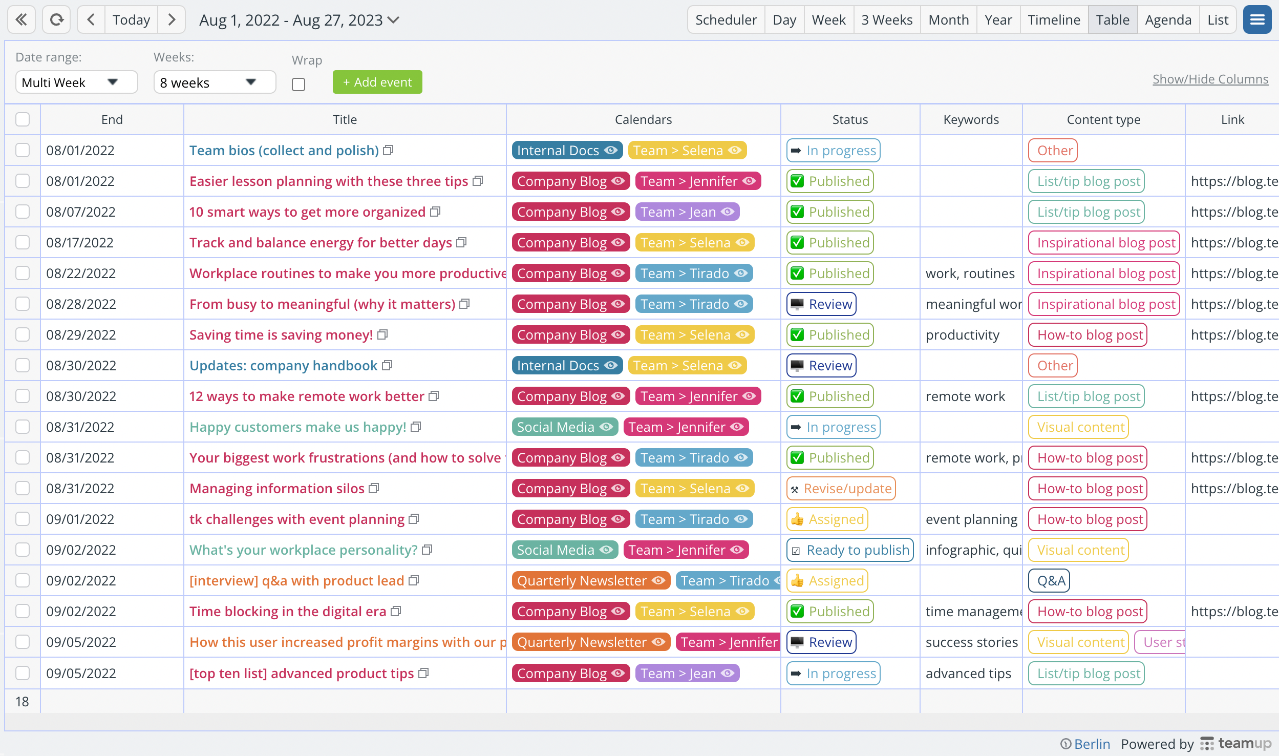
- Choose from a palette of 48 colors for each sub-calendar.
- Color-coding is as simple as assigning an event to the relevant sub-calendar(s) from a dropdown list.
- Custom field options also have assigned colors.
- Color-coded events can be displayed in the most appropriate calendar views.
2. Lack of visual context and cues
Spreadsheets are good at holding data and sorting data. They’re not good at providing context or displaying calendar data with visual cues about what the data means and why it matters. You can create charts and graphs from the spreadsheet data for visual display, but working within the spreadsheet itself is all about rows and columns of text or numbers.
How Teamup meets this challenge
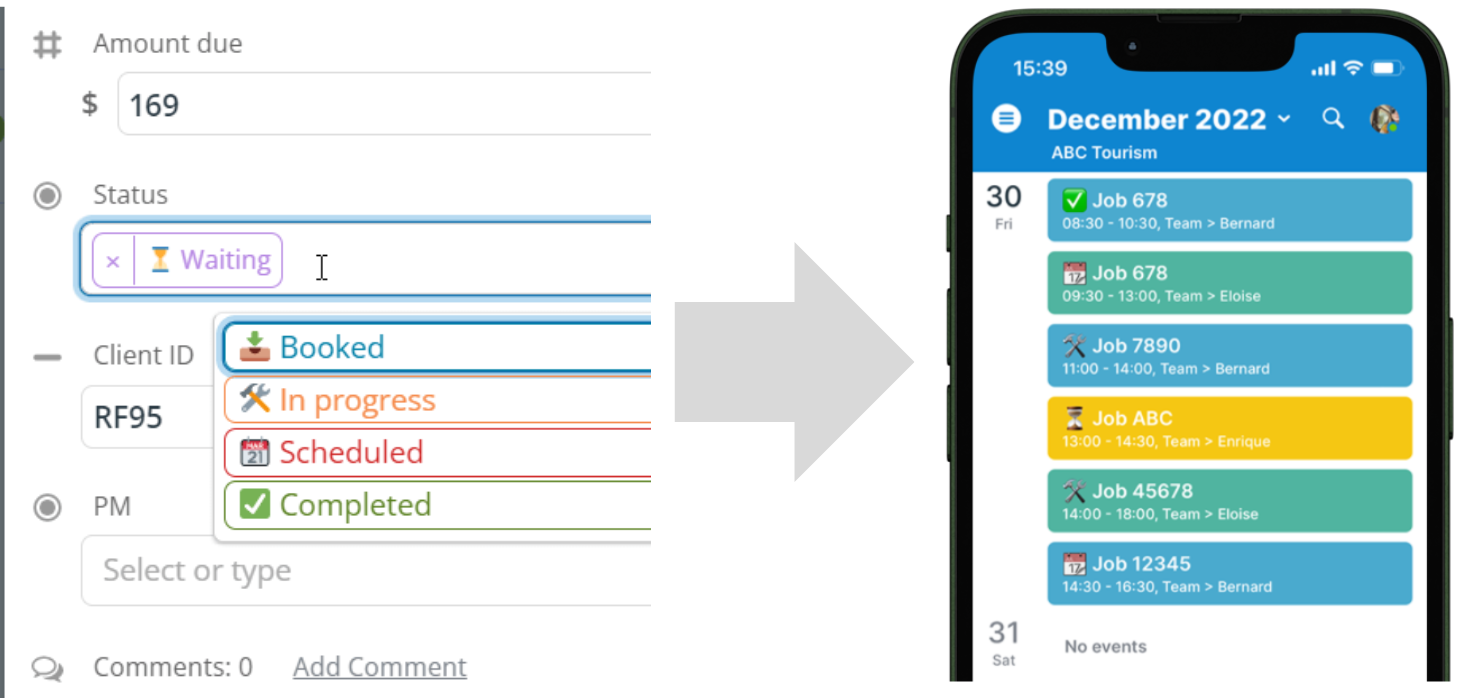
Maybe you want to track status for jobs, as they move through your departmental workflow. In Teamup, you can assign emojis to display in event titles for quick visual cues. Then you can quickly see the current status on any job with the visual cue provided by the emoji.
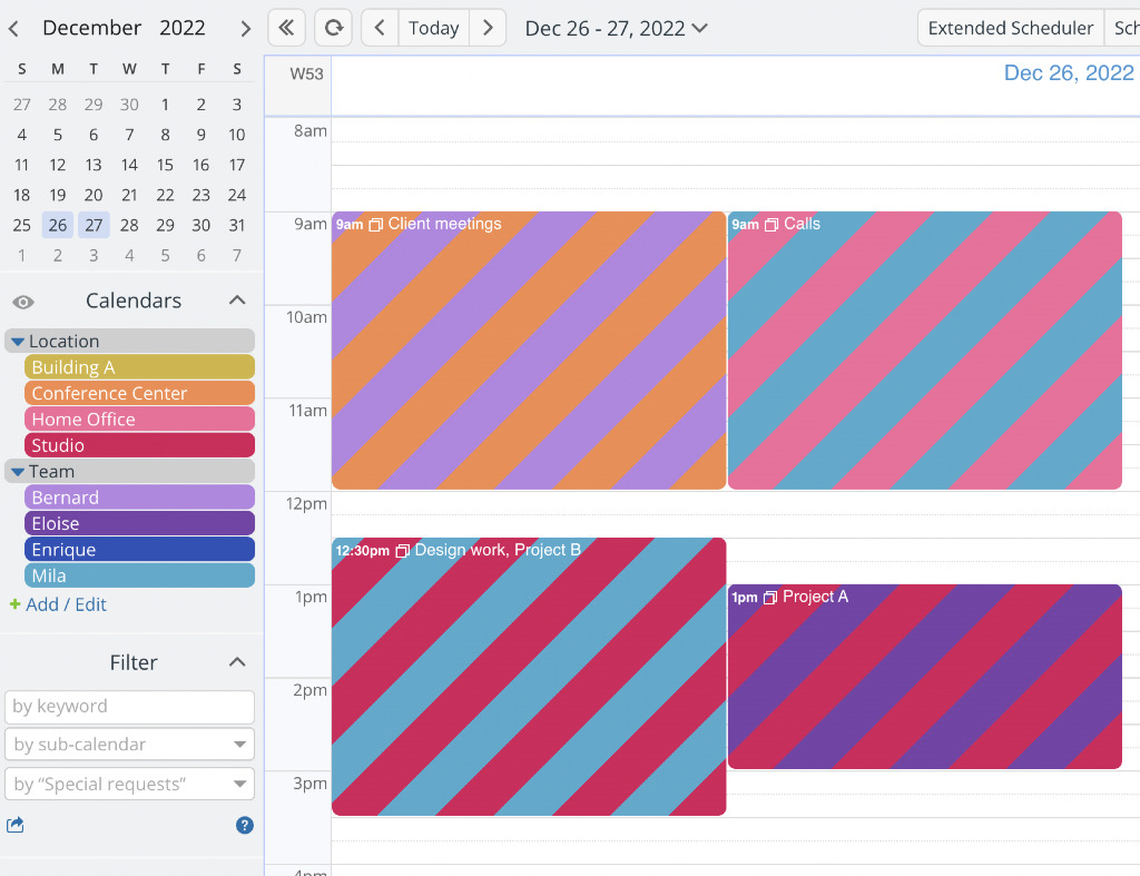
An event could have several dimensions, or factors: people, location, resources, status, and so on. For example, the shared booking calendar shown below has two dimensions, the shared spaces and the individual team members. An event, like client meetings, can be assigned to multiple sub-calendars: in this case, a Location sub-calendar and a Team sub-calendar. The striped colors immediately give a clue about the factors for this event:
- Assign an emoji to options and make emojis visible in event titles.
- Use color-coded sub-calendars for multiple dimensions.
- Striping shows the assigned dimensions with immediate visual recognition.
3. No sense of perspective
Spreadsheets cannot provide any sense of perspective in relation to your data. It’s data. It’s in a row or a column, which doesn’t provide any visual cues to help you understand where it belongs in time. Zooming in or out to view different sections doesn’t reveal a shift in perspective, only in what portion of the spreadsheet is displayed. So if you’ve set rows to represent weeks, for example, you can’t adjust that setting to get insight in a different time perspective (such as an hourly grid, or a longer-term view of multiple months or a year).
How Teamup meets this challenge
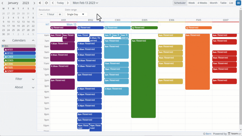
To plan a schedule for shared classrooms, as shown below, it’s helpful to see have different perspectives. You may want to make adjustments to the current day’s schedule, based on last-minute availability changes. So you’d want to focus on just one day to complete that rescheduling task. But when you’re looking at the bit picture, over weeks or months, you need the ability to zoom out. Click the image below to see adjustable resolution in action:
- Choose the best calendar view for your current task or needed perspective.
- Set the defaults for the perspectives you need most often.
- Adjust the resolution to zoom in on details or out for a long-range view.
- Toggle sub-calendars off or on depending on which are relevant.
4. Overwhelming text-based view
There’s no way to stop your brain from trying to read words or make sense of numbers. It’s something we do automatically once we’ve gained the skills. When you’re facing a spreadsheet full of text and numbers, your brain is working overtime, immediately, even if making sense of each cell in your view isn’t needed for the task. Cognitive overload is another one of the big disadvantages of using spreadsheets.
How Teamup meets this challenge
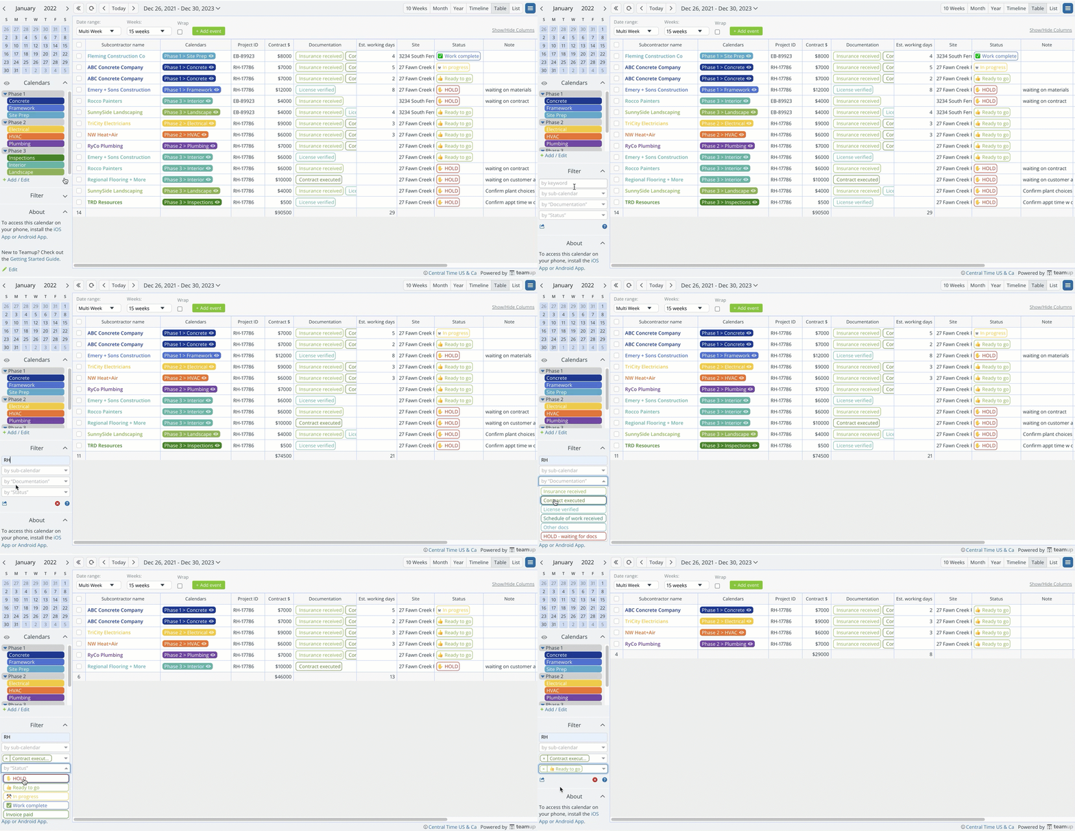
When dealing with a lot of information, you need quick ways to focus on what matters and tune out the rest. For example, here’s a subcontractor management calendar in Table view. Using multiple filters instantly declutters the data to show only what’s needed.
- Filter by keyword, sub-calendar, or custom field.
- Combine filters to find data that matches multiple criteria.
- Manage multiple dimensions in one place using sub-calendars and custom fields.
5. Data conflicts are not visually displayed
Spreadsheets don’t have the functionality to highlight a scheduling conflict in a visual way. You might catch it when you review the plan, but you might not. The margin for error is always high when you’re creating a schedule that needs to consider many complex factors. Having conflicts buried without a fail-safe increases the chance of mistakes making it out of the spreadsheet, which is why making the calendar data visual is so important.
How Teamup meets this challenge
This booking calendar is used to schedule client sessions with trainers. Of course, it’s really important not to double-book trainers. You can configure any sub-calendar to disallow overlapping events and automatically prevent conflicting events:
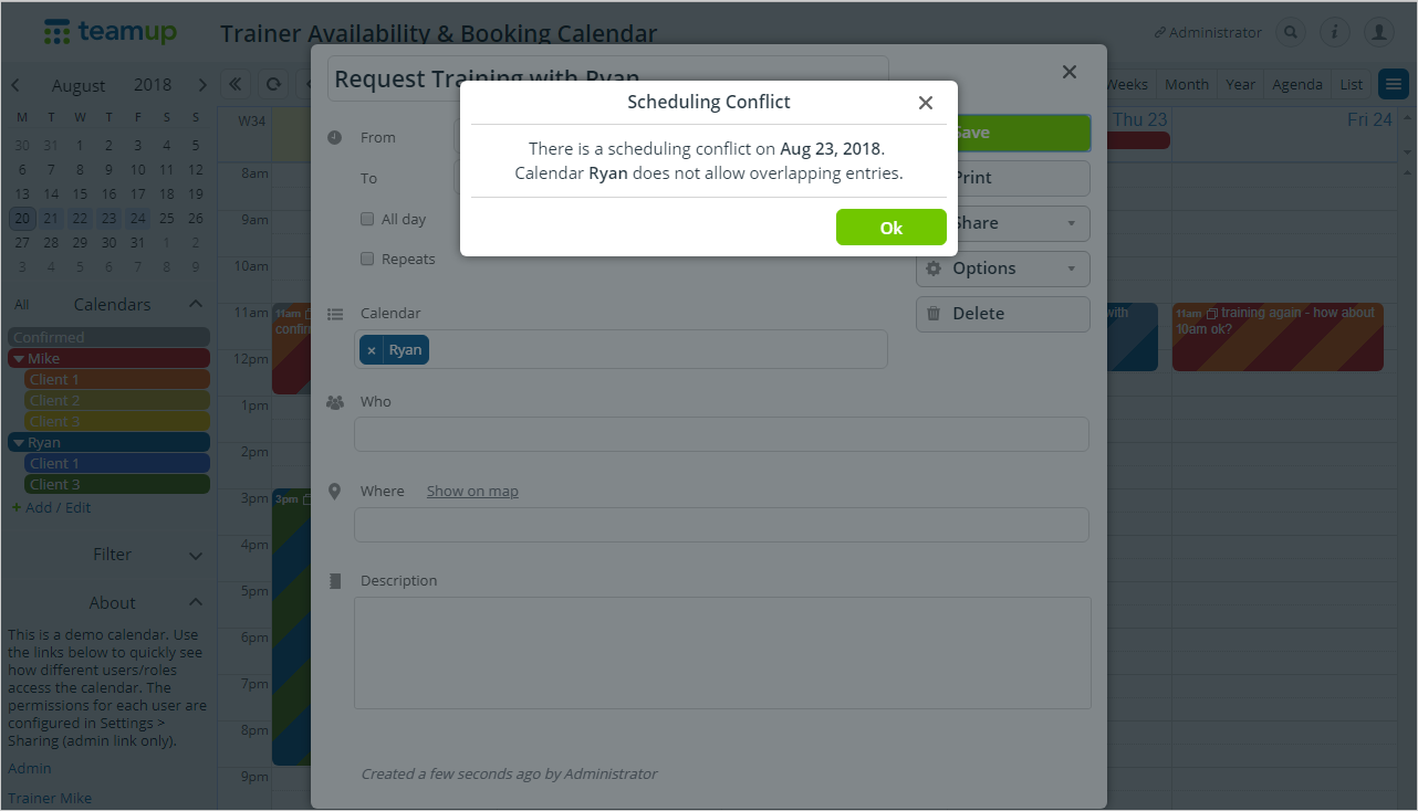
- Prevent double bookings for any sub-calendar with a simple setting.
- Enable self-booking for clients, students, etc.
- Keep confidential information secure with no-details access.
6. No visual display of multiple dimensions
Spreadsheets are inherently two-dimensional: you get rows and you get columns. This design limits the way you can work with and visualize data that has more than two dimensions. While you can use more complex techniques such as pivot tables or multiple sheets, the data gets “separated” and you have to click into different sheets to see various dimensions of the data. The disconnection can make the work error-prone and slow, while a visual scheduling tool can help streamline the process.
How Teamup meets this challenge
This shipping calendar is used to track orders from beginning to end. There are multiple dimensions for each order, such as payment status, type of cabinetry, shipping status, and more. Here, custom fields are used to track these important factors:
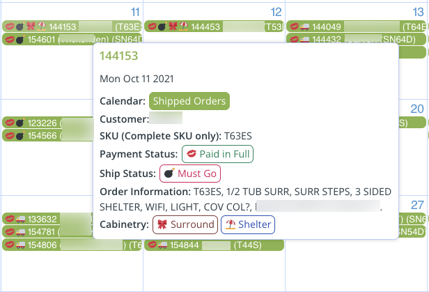
- Don’t limit yourself to 1 or 2 key factors; track them all with custom fields.
- Get automatic sums with a numeric field.
- Hover over any event for a quick preview of the details.
- Easily sort calendar data by column in Table view.
7. Time-consuming navigation
Spreadsheets get quite unwieldy. The more data you have to manage in a spreadsheet, the more difficult it is to use a spreadsheet to do it. It can become difficult to navigate and locate specific cells or data points. It’s not easy to quickly move around if you need to compare data from a year ago with current numbers, or jump ahead to future projections. Plus, you’re limited to a single view without adjustable perspective. On Teamup, jumping forward to the next year or moving back to view past data takes seconds.
How Teamup meets this challenge
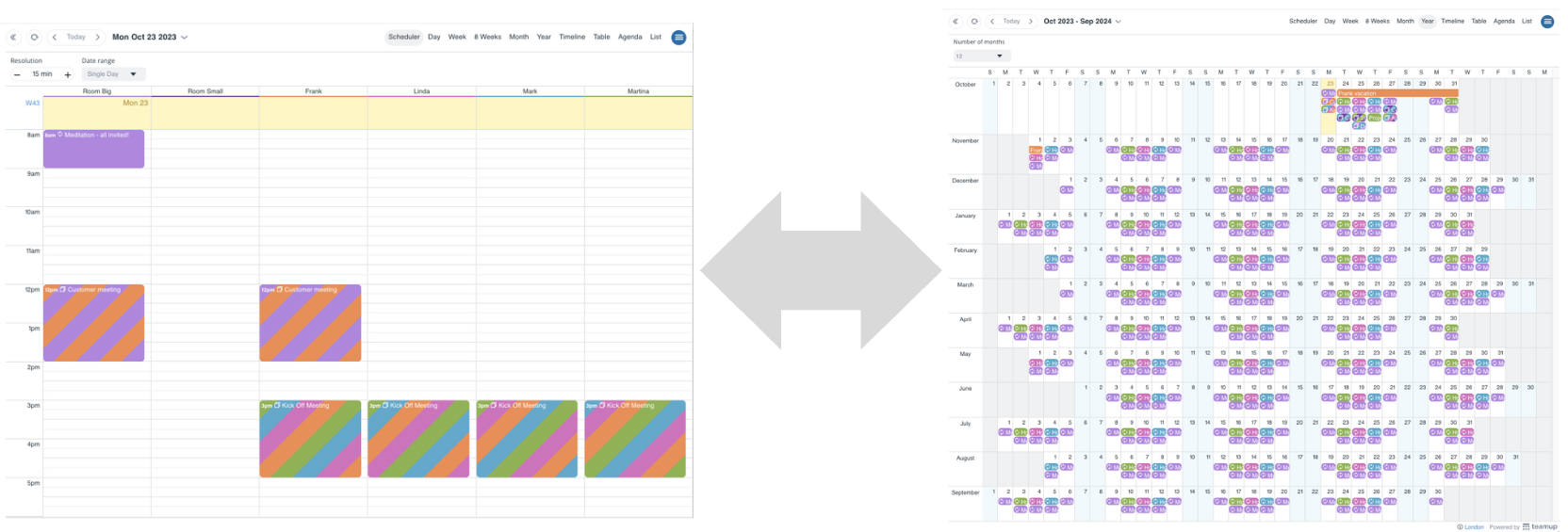
The date picker is the small monthly calendar, just above the list of calendars in the control panel. There is also a pop-up date picker in the top bar of your calendar; you can click the Today button to go to the current day immediately. Both date pickers work in the same way: Use arrows to move between months or years, or scroll between dates. Click a date to open.
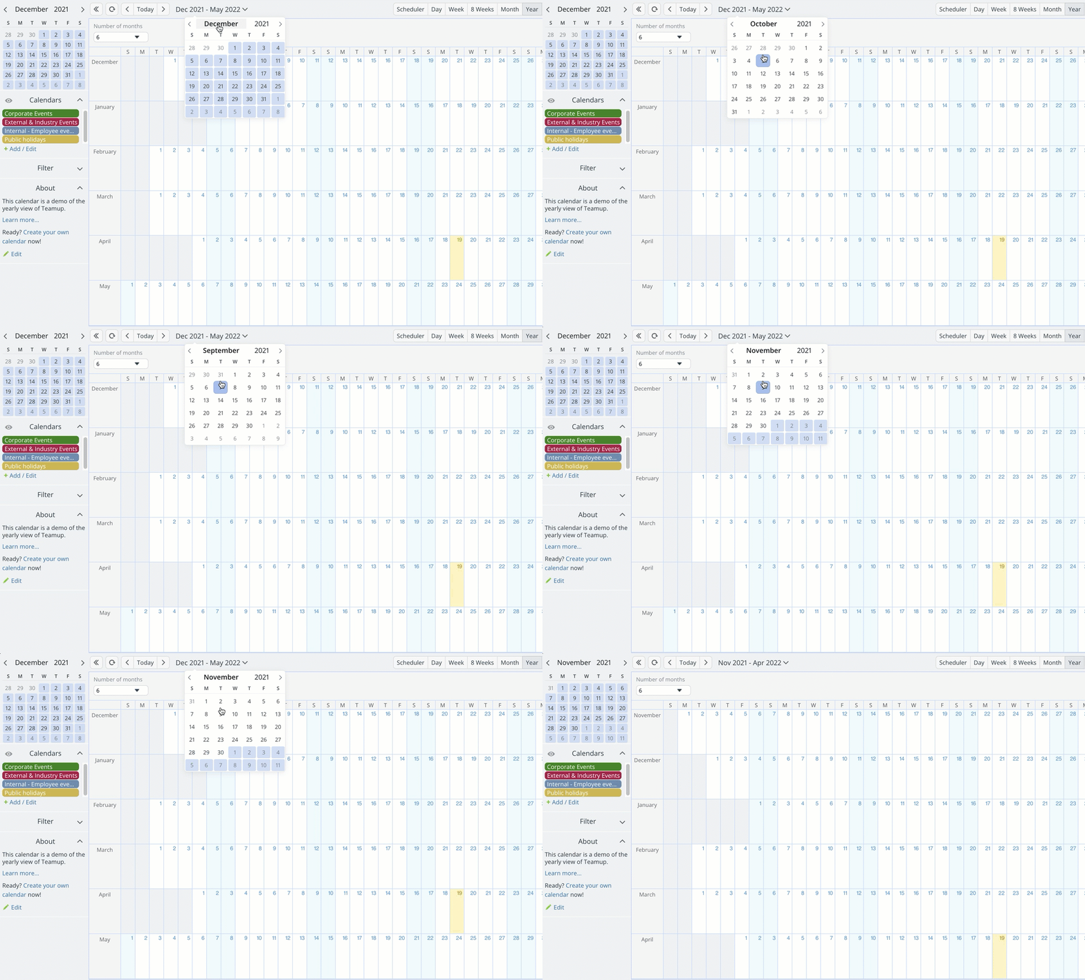
You can change views from the small scale (hourly) to big scale (yearly). And there are options for working in each scale. For example, there are 3 ways to work with 1 year (or more) at a time: Yearly view (1-12 months), Multi-week view (up to 53 weeks), and Scheduler view (up to 5 years).
- Navigate quickly with the Today button, arrows, or scrolling through the date picker.
- Choose the calendar view for the scale you need.
- Adjust views to work with a precise number of weeks or months over any date range.
8. Limited collaboration options
Version control can become an issue when multiple users are collaborating on a spreadsheet. It’s easier for changes to be accidentally overwritten, leading to data loss or inconsistencies. There’s also a limited ability to customize permissions, a pretty serious addition to the list of disadvantages with using spreadsheets. For example, Google Sheets offers four permission levels: ownership, edit, comment, and view. None of these permissions allow for granular control of what a user can edit. It’s an all-or-nothing permission level which is often not appropriate for the role.
How Teamup meets this challenge
For example, if you’re planning a conference, you may be working with internal staff members as well as speakers and other collaborators. Speakers may want to view their planned session schedule, but you don’t want them changing anything on the calendar. Meanwhile, staff members need to be able to make adjustments depending on their role. As shown here, you can set individual permissions for each user by each individual sub-calendar:
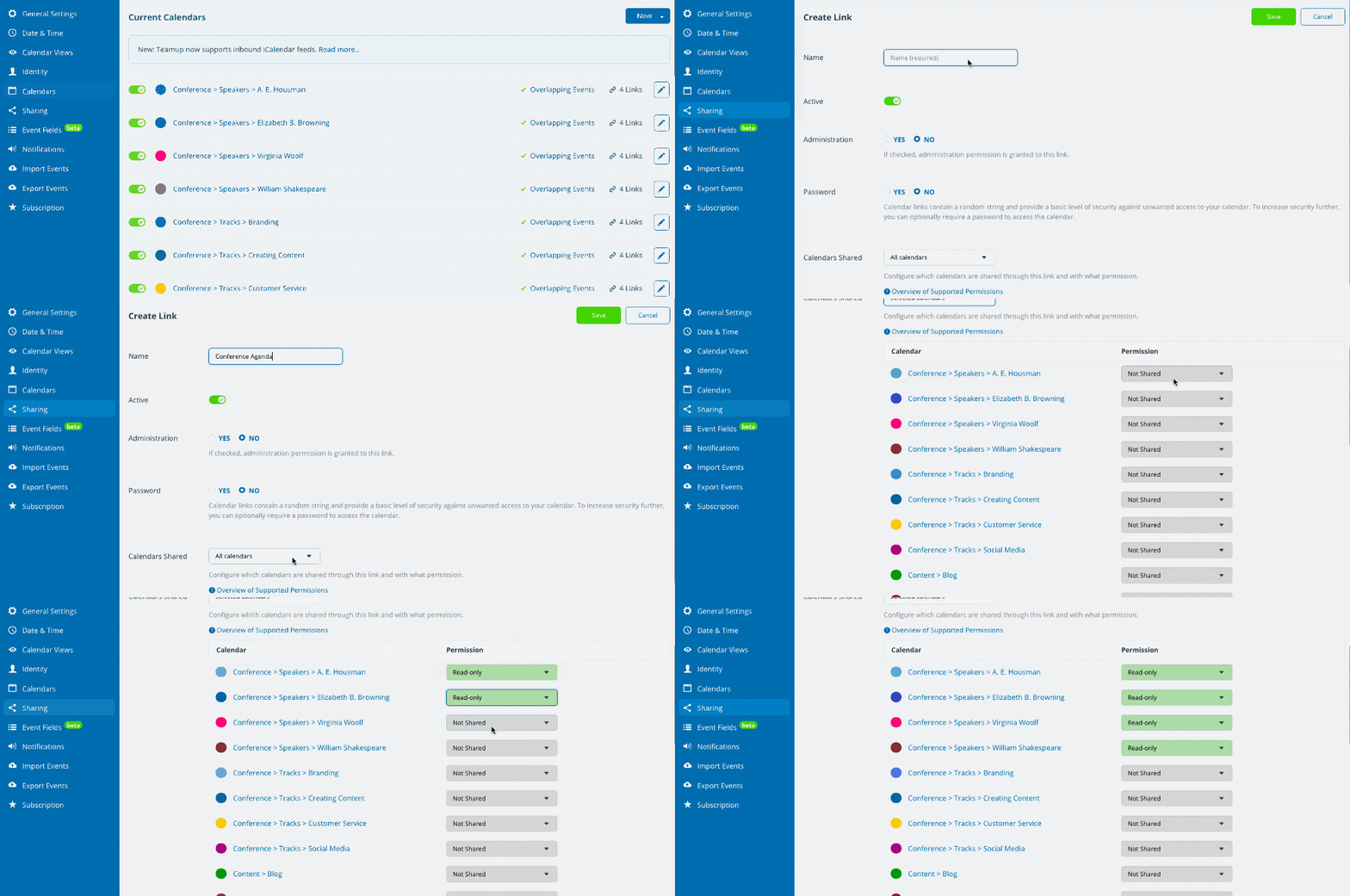
- Apply customized access permissions for internal users and external collaborators.
- Choose the best access method: account-based access or shareable links.
- Ensure everyone sees the latest updated version.
- Use event comments for in-context discussion, notes, and resource sharing.
9. Limited function to connect related material
Spreadsheets have one primary function: they’re used for organizing and analyzing tabular data. They do that well, but they don’t have the functionality to store or display related files that might be relevant or even necessary in order to make sense of the data (documents, images, worksheets, guidelines, and more). While you can link to external files in a spreadsheet, these links are easy to lose in a large spreadsheet and may become outdated, which can lead to errors when they are referenced.
How Teamup meets this challenge
With inline image display, you can keep the images or other files right in the context where you need it. Need a reference image or blueprint? Upload it to the calendar and it’s right there, whether you’re at the office or on the road.
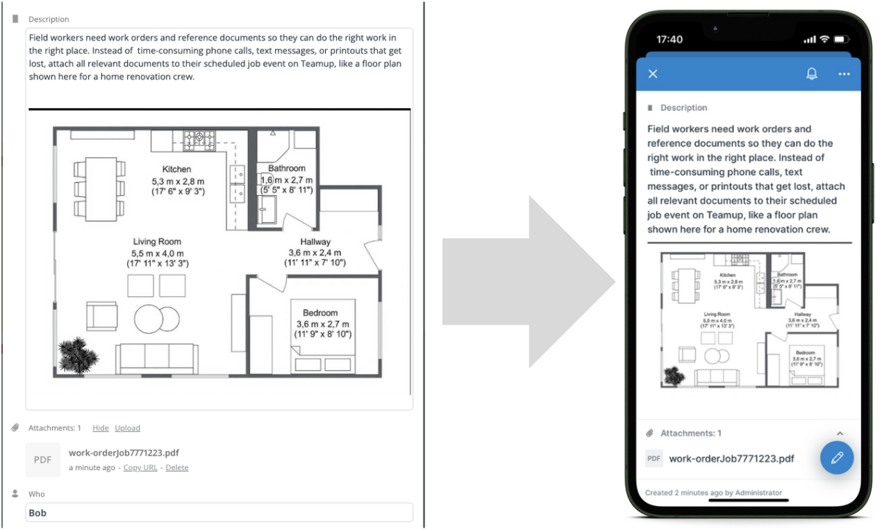
- Upload files in three areas (Description, Attachments, and Comments).
- Add key information and links in the Description or in custom fields.
10. Limited access and compatibility
While it’s technically possible to view spreadsheets on a mobile browser or with an app, it isn’t practical. One of the disadvantages of using spreadsheets is that they’re designed for larger screens, with a mouse and keyboard. But we’re a mobile generation. Trying to work with a spreadsheet on a small touchscreen device tends to get frustrating fast. Cross-platform work might be tricky, too, since some spreadsheet software is meant for specific operating systems.
How Teamup meets this challenge
If the schedule is only on a spreadsheet, employees in the field can’t access it easily. Since it’s tough to view a spreadsheet on mobile, they’ll probably rely on a printed copy. If something changes, the printed copy is outdated; office staff have to email, call, or message field crew to keep everyone up-to-date.
Here’s a field crew schedule on Teamup’s mobile app. The List view, on the left, shows employee John’s assigned jobs for the day. On the right, John has uploaded a photo in the event comments.
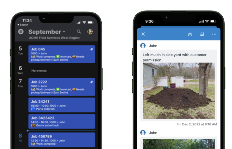
Everyone can stay updated via Teamup mobile apps for iOS and Android, able to see their scheduled jobs and add notes and images for documentation. You can set up a widget for quick reference of what’s next, and tap to open an address in maps.
Try Teamup as your visual schedule builder
Whether it’s optimizing production lines, assigning field service technicians, coordinating conference tracks, managing shared resources, or creating an academic course calendar, visual schedules bring clarity, reduce errors, and encourage efficiency. Try one of our full-featured live demo calendars to see for yourself. You can explore different scenarios, adjust settings, and test your ideas. See if it’s a good fit to help you overcome the disadvantages of using spreadsheets. When you’re ready, create your own calendar and start setting up for a more streamlined, visual way to work with your data.

