
Last updated Oct 30, 2023
We learn best, work best, and remember best when we have a visual display of information or data. That’s why having tools like a visual schedule maker can help, because you can visualize calendar data while scheduling instead of seeing rows and numbers or lines of text. It’s easier for us to comprehend, which streamlines the process of scheduling, analyzing, and making decisions. Here’s a quick look 👀 at why (and how) the best way to work is to visually display the data we’re using.
How selective attention works
When we’re inundated with large amounts of information — which is always — our brains have to make quick decisions about what to focus on. It’s a process of filtering and focusing called selective attention.
“This is an important process as there is a limit to how much information can be processed at a given time, and selective attention allows us to tune out insignificant details and focus on what is important.”
When your brain is filtering, guess which data gets selected for attention?
Actually, you don’t need to guess. You already know.
Imagine you’re sitting at your desk. You open a spreadsheet with rows and rows of text and numbers; it’s all the same shade of light gray except for one column which is brightly colored. You’re going to notice that brightly colored column first.
Or, you’re reading a long email with paragraphs of text and one single image. Your eyes keep straying back to that image in the middle of all those words.
The brain notices what is visually interesting
We notice (or select for attention) the things that are visually interesting more than those that are not. There are plenty of reasons we might do so, from assessing threat (movement could mean danger) to satisfying our curiosity (what is that brightly colored object?) to simple aesthetic appeal. Another important reason, though, is that information presented visually is easier for us to comprehend and remember.

Vision is our dominant sense
You’ve probably heard statistics like “65% of people are visual learners.” But the truth is that all of us are visual learners:
“Vision is by far our most dominant sense, taking up half of our brain’s resources… We learn and remember best through pictures, not through written or spoken words.” —Dr. John Medina.
Dr. Medina also explains that adding a visual with information helps us remember it, improving retention from 10% to 65%.
Visual information is processed faster
We comprehend information faster when it’s visual — much, much faster. An MIT study found that we can process an image in as little as 13 milliseconds. Try reading a word in 13 milliseconds. It won’t work. That’s because, as Dr. Medina explains, reading is quite inefficient as a way for us to get information. We have to break down each word into letters, then put it back together again, and connect the word with its associated meaning. We do this with amazing rapidity, but it’s no match for how quickly we can process an image.
“The job of the eyes is not only to get the information into the brain, but to allow the brain to think about it rapidly enough to know what you should look at next.” —Dr. Mary Potter, Professor Emerita, MIT Department of Brain and Cognitive Sciences
Visuals in education and business

Educators understand the power of creating a visual display of information or data. They know that visuals help with comprehensions, retention, speed and ease of learning, and motivation to learn. Plus, images connect with our emotions in a way that rows of words and strings of numbers cannot, which creates strong memories.
The same principles work in business settings, too:
- Data visualization can help reduce meeting duration by 24%.
- Companies that use data visualization make and execute decisions faster than their competitors.
- Business tools that incorporate visual aspects improve how people work: they’re 28% more likely to access the information they need, and 48% less likely to need help retrieving it.
We learn better when information is visual, and we work better when information is visual. So if you’re still relying on core tools which show only lines of text and columns of numbers 😥 maybe it’s time to add some new tools to the mix.
Teamup as a visual schedule maker
Let’s just take a look at a few examples.
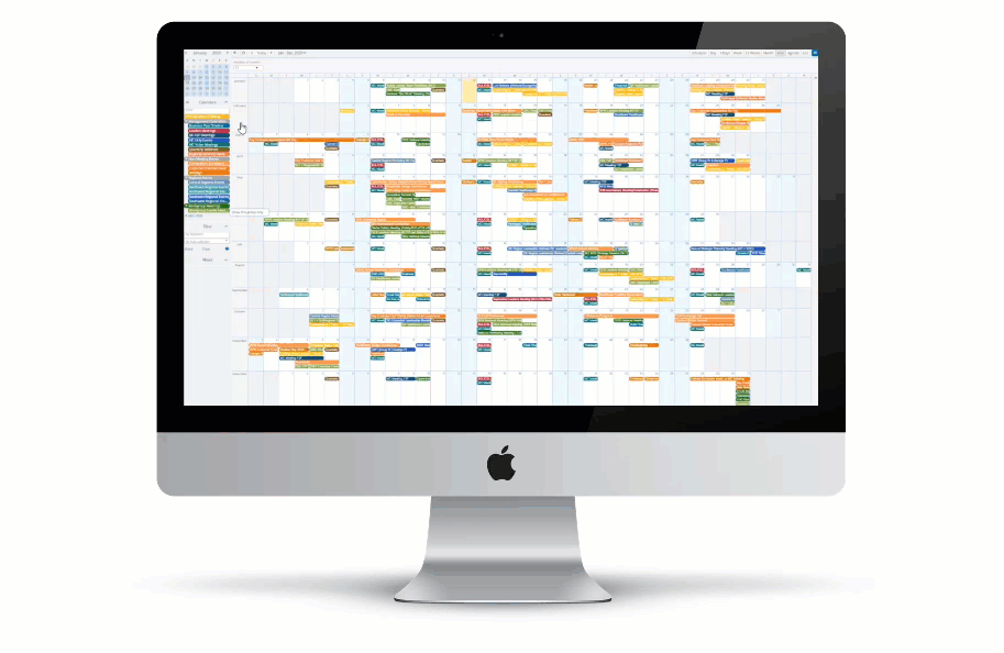
Excel-based annual plan
Here’s the old version of an annual plan (click to see it, if you dare). It’s not a good way to visualize calendar data, because there’s nothing visual about it! But that’s often what you’re asked to work from, which means your brain has to work harder without a visual display of the information you’re using.
Here’s how it can look on a Teamup calendar:
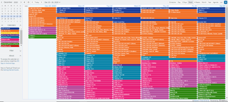
Schedule overview of multiple locations
Here’s a color-coded overview of scheduled activities across multiple branch libraries in a county public library system in the U.S. Smart use of color is one of the best ways to visually display data. We’re attracted to color, and once it’s assigned to a context or meaning, we can quickly pick the color up as a visual cue.
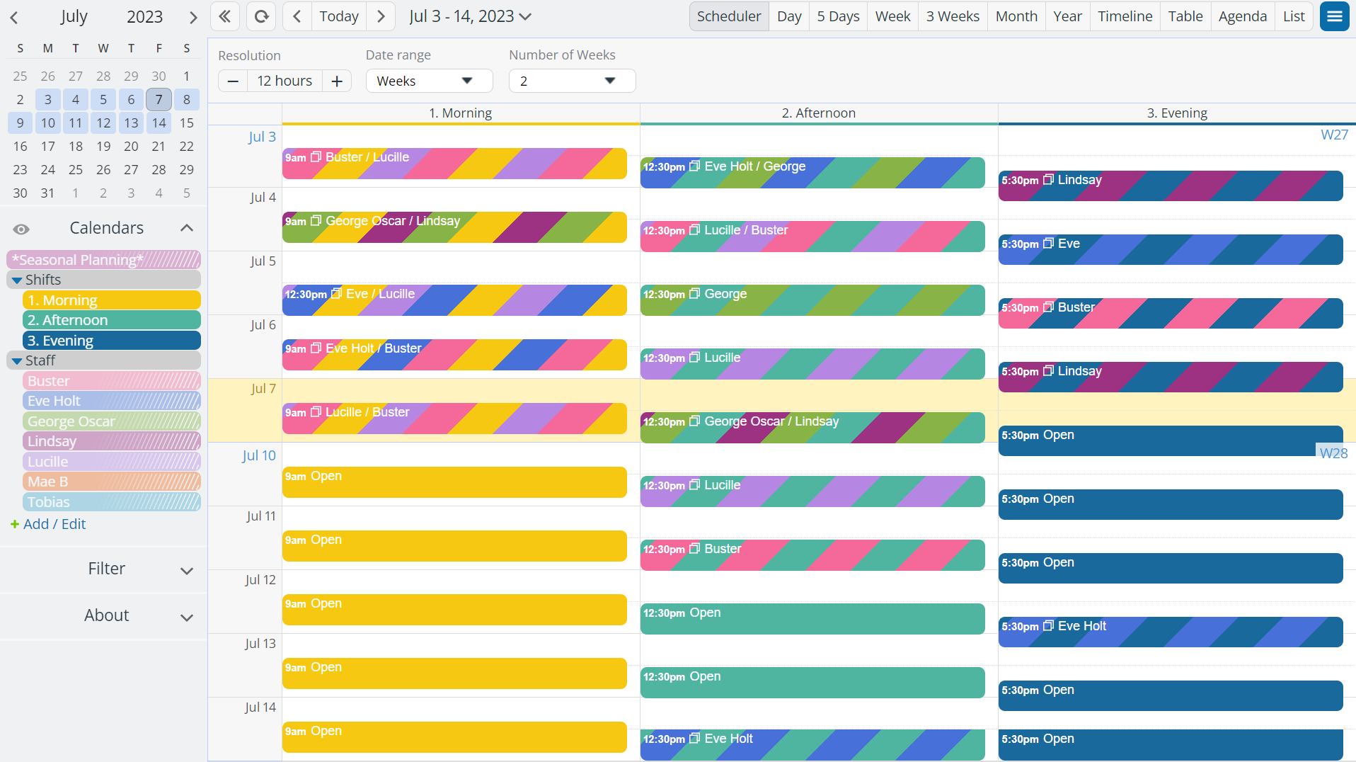
Shift scheduler with visual cues
Across many scenarios and industries, people are asked to match resources with needs. It might be matching equipment with jobs, employees with shifts, or lab equipment with open times and research teams. It can get complicated, which makes a visual display of the information or data that much more important. Here’s an example of Teamup as a visual schedule maker, showing a colorful shift scheduler that reveals at a glance which shifts are open and which have assigned staff:
The best way to understand how Teamup might fit into your toolbox is (no surprise here) to see for yourself. Try out one of our live demo calendars. Click around, move things, investigate settings, explore features, and imagine the (visual) possibilities.