Last updated Feb 22, 2024
With Teamup’s sub-calendars, color-coding is easy. Choose from a palette of 48 colors and assign the right one to each calendar. You can even use a CSV template to import your color-coded calendar structure! When you color-code your calendar, you gain visual cues that can increase your efficiency. Your brain can quickly identify events based on color, at a glance. Plus, color-coding can create a more appealing calendar look, whether you prefer a bright rainbow or a minimal look.
The benefits of color-coding
Research shows that color enhances memory performance and is “as a powerful information channel to the human cognitive system.” We’re all overwhelmed by lots of information and tasks that demand our attention. Our brains sort through a huge amount of data every day, and most of this processing is visual.
Color works as a powerful cue that shortcuts processing time.
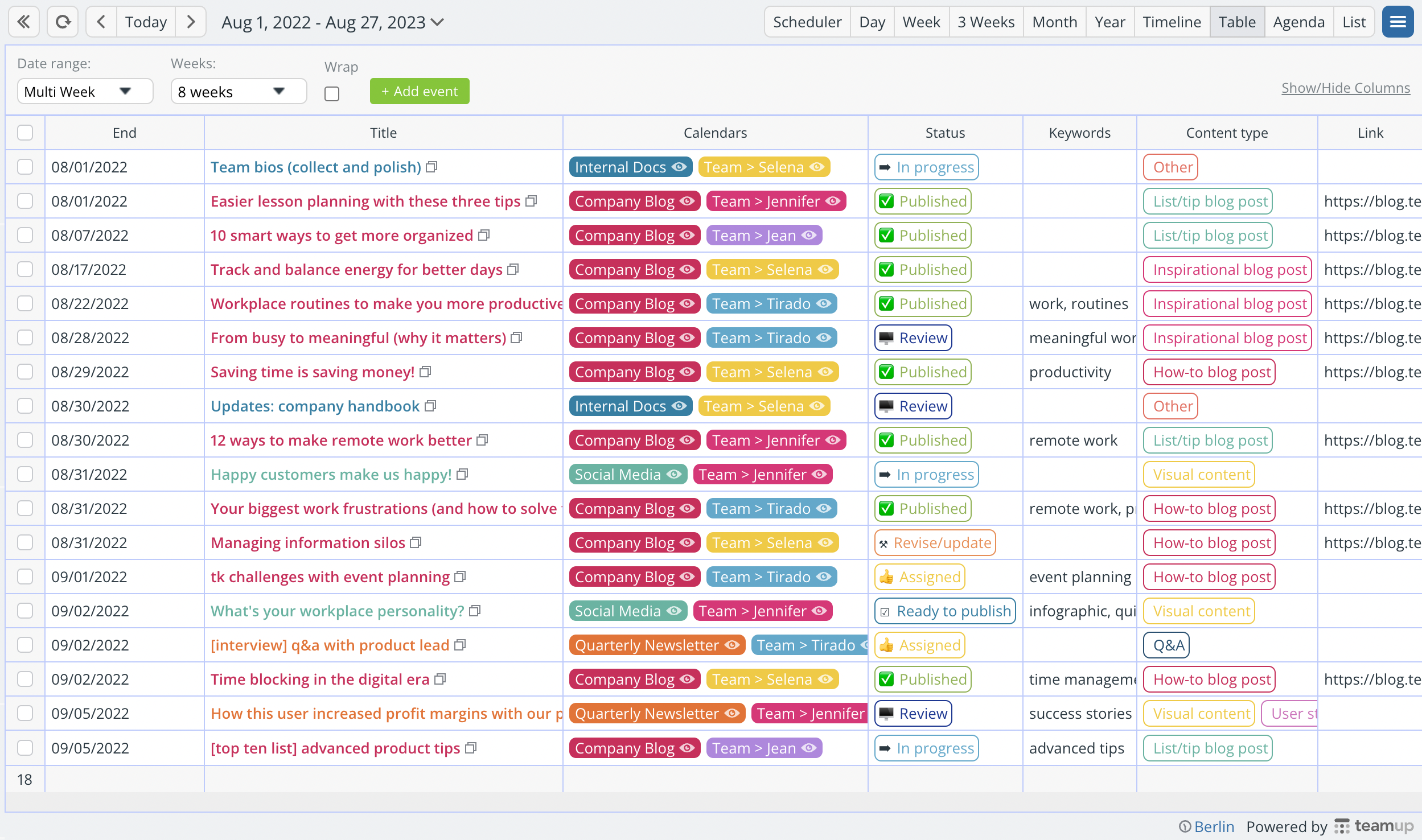
When you associate the color red with urgent, you’ll automatically start paying attention to the red-colored events on the calendar first.
You can use the same concept to automatically understand the context of any calendar event.
It may seem like a small effect, but consider that your brain is receiving, processing, and responding to enormous amounts of data every single day. A shortcut that shaves off a few seconds of processing time, over and over, can result in lots of saved time over days and weeks. Plus, color recognition means less cognitive load, since it reduces the attention needed to sort and categorize each bit of information.
Keys to color-coding like a pro
Okay, now that you know why it’s smart to color-code your calendar, let’s take a look at how to do it well.
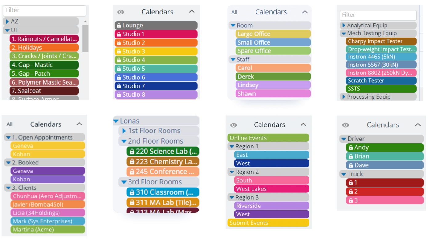
Be consistent
When it makes sense in an operational context, you can carry color-coding from the calendar to other parts of the workflow. The consistency makes it easier to keep things organized and get those quick visual cues. For example, here’s a great example of consistent color-coding from calendars to supplies to vehicles:
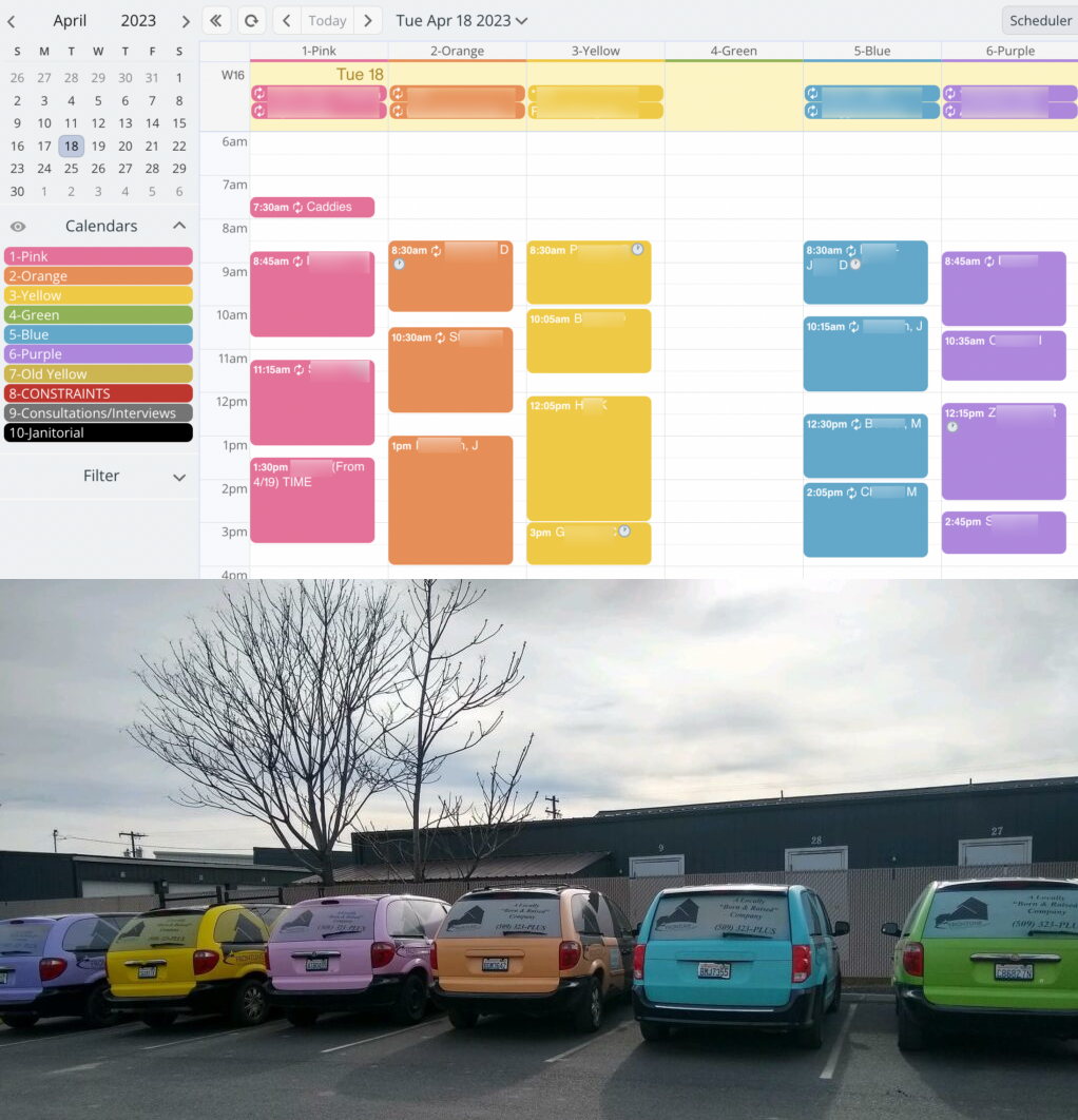
When you can maintain consistency with color-coding, it makes it easier for people to remember. Of course, context matters: don’t try to force a color scheme if it doesn’t work for the way you work! And with Teamup’s flexibility and 48 colors to choose from, it’s easy to adjust color-coding to match preferences.
Use contrast
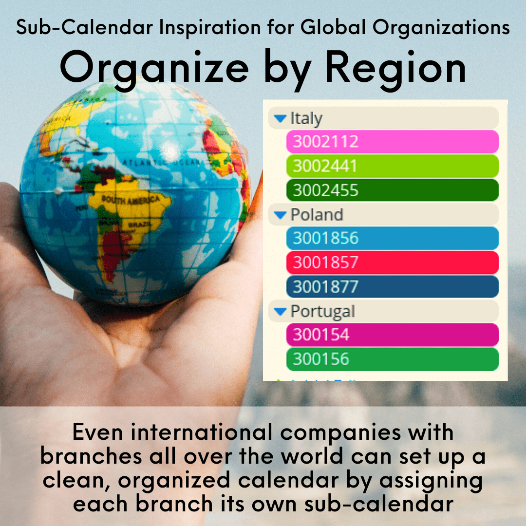
For maximum visual impact, choose contrasting colors. Dark and light colors, or warm and cool colors, will contrast with each other and make it easier to visually distinguish between each one.
Work with color families
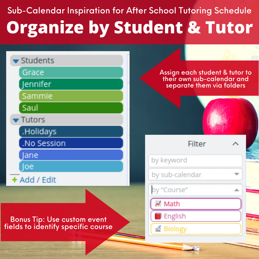
When you have a larger number of sub-calendars, color families can help with visual distinction. For example, perhaps you have 5 team members for Department A. All the calendars go into a Department A folder, and are assigned colors in the warm red-pink family. When you see an event in that color family, you automatically know it belongs to someone in Department A. For Department B, choose a contrasting color family (e.g., cool blues).
Color-code across dimensions
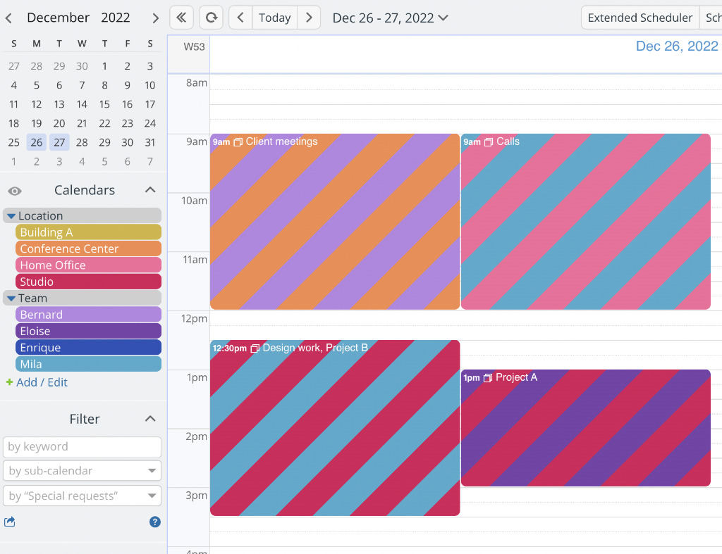
Perhaps you use calendar color-coding for one dimension (e.g. people), and you need a way to visually distinguish another dimension (e.g. task type, or location).
You can accomplish this with two sets of sub-calendars. Each set represents one dimension. Assign any event to the relevant sub-calendar from each set, for a dual color-coded look like this:
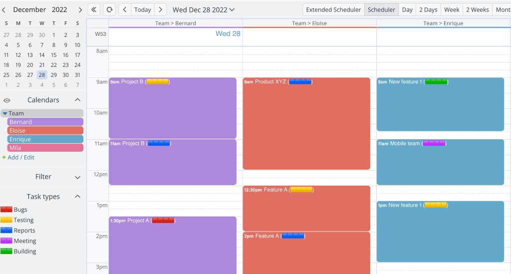
If you don’t want to use multiple calendars, or don’t like the striping effect, use a custom field with color blocks instead:
Try it out!
Thoughtful and consistent color use helps with efficiency by giving visual cues that help you process information faster. Ready to get started with color-coding? Learn how to set up a color-coded calendar structure with a CSV template, and try it out on this live demo calendar.

